Mendoza Immigration
A platform to help immigrants in the United States fill out legal immigration documents with less technical language.

Streamlining the Immigration Process
What I Did
User Research
UX/UI Design
Visual Identity
Prototype & Testing
Concept Project
The Mendoza Immigration Law firm developed a platform to help immigrants in the United States fill out legal immigration documents with less technical language. However, the platform is currently confusing and overwhelming for users, leading to difficulties in completing the necessary paperwork.
The goal is to create a user-friendly platform that simplifies and guides users through the process of filling out the required paperwork more intuitively. The target audience is immigrants who may have limited English proficiency or may not be familiar with legal terminology.
By creating a more user-friendly platform, the Mendoza Immigration Law firm aims to help immigrants navigate the complex legal system with greater ease and accuracy, improving their chances of obtaining legal status and remaining in the country.
Currently, the platform provides support for three distinct immigration processes. For the purpose of this project, I specifically focused on the DACA Renewal process.
Uncovering User Insights
I’m not a US citizen so firstly, I conducted research into the DACA renewal immigration process to gain a deeper understanding of the requirements and qualifications for legal permanent residency in the United States. This helped me define the specific target audience and the specific needs they had in the document-filling process.
Additionally, I reviewed data from the Mendoza Immigration Law firm's previous months of testing the platform to identify potential pain points that were causing confusion or overwhelming for users.
To further assess the platform's usability and identify any additional pain points, I tested the platform with a few users, observing how they interacted with the platform and where they encountered issues.
From this testing, I identified three key pain points that needed to be addressed:
Confusion in navigating to the platform
1.
Users are facing difficulty navigating to the platform as the website design lacks clarity. The buttons don't have an apparent visual distinction, which makes it hard for users to identify which button to click. Additionally, the buttons don't have a traditional button shape, which further adds to the confusion. The lack of clarity in the design is causing users to feel lost and unsure of how to proceed to the platform.
Overwhelming information about what to do
2.
Users face the challenge of feeling overwhelmed with the amount of information presented to them. The steps involved in the process are not very clear, leading to confusion and uncertainty. Users struggle to track where they are in the process, and the sheer volume of information presented can be daunting. This can lead to frustration and discouragement, causing users to abandon the process altogether.
Uncertainty about the progress status as they completed the document-filling process.
3.
Users face the challenge of feeling overwhelmed with the amount of information presented to them. The steps involved in the process are not very clear, leading to confusion and uncertainty. Users struggle to track where they are in the process, and the sheer volume of information presented can be daunting. This can lead to frustration and discouragement, causing users to abandon the process altogether.

Design Principles for a Universal and Simpler Platform
I made the decision to have design principles for this project to ensure that my UX and UI designs were aligned with the goals and objectives of the law firm and its users. These principles helped guide my design process and ensured consistency across all design elements.

Wireframing for a Clear and Logical Platform Structure
During the wireframing process, I focus on creating a clear and logical structure for the platform. I experiment with different layouts and information architectures to determine the best way to present information to the user. I also make sure that the wireframes align with the goals and requirements of the project and ensure that they meet the needs of the target audience.

Elevating Brand Perception
To meet the brand's need for an update and make it more contemporary and approachable, I decided to modernize the UI design while still maintaining the law firm's seriousness and essence. I used a modern color scheme with a friendly font to create a more relatable design.
Overall, the UI design was updated to be more user-friendly and approachable while still maintaining the law firm's professionalism and seriousness.

Welcome to Mendoza Immigration
A more straightforward and clear homepage presenting a brief description of Mendoza Immigration services and the team. To ensure that users could quickly understand the purpose of the website and navigate it with ease.

Enhancing User Navigation
To solve the navigation problem that users were experiencing, I decided to use a sticky bar at the bottom of the screen. Since the platform is accessed from the main law firm website, I needed to highlight this service and make it easily accessible from any page on the website.
I chose a sticky bar because it is a simple yet effective way to keep the platform front and center for the user, without being too intrusive. As a persistent, fixed element that remains visible as the user scrolls down the page, the sticky bar serves as a constant reminder of the platform's availability.
Renew Your DACA Status
The DACA Renewal page describes the services they offer and how they can help individuals renew their DACA status. The page includes a step-by-step process to explain the renewal process. The design is user-friendly and makes it easy to find the information needed to start the renewal process.

Designing an Intuitive Platform to Overcome Information Overload
I took several UX design decisions to address the overwhelming amount of information. First, I removed unnecessary information, then broke down the remaining information into clear and manageable steps. Finally, I revealed information gradually to avoid overwhelming users. These design choices helped to simplify the process and make it more approachable for users, creating a more user-friendly experience.
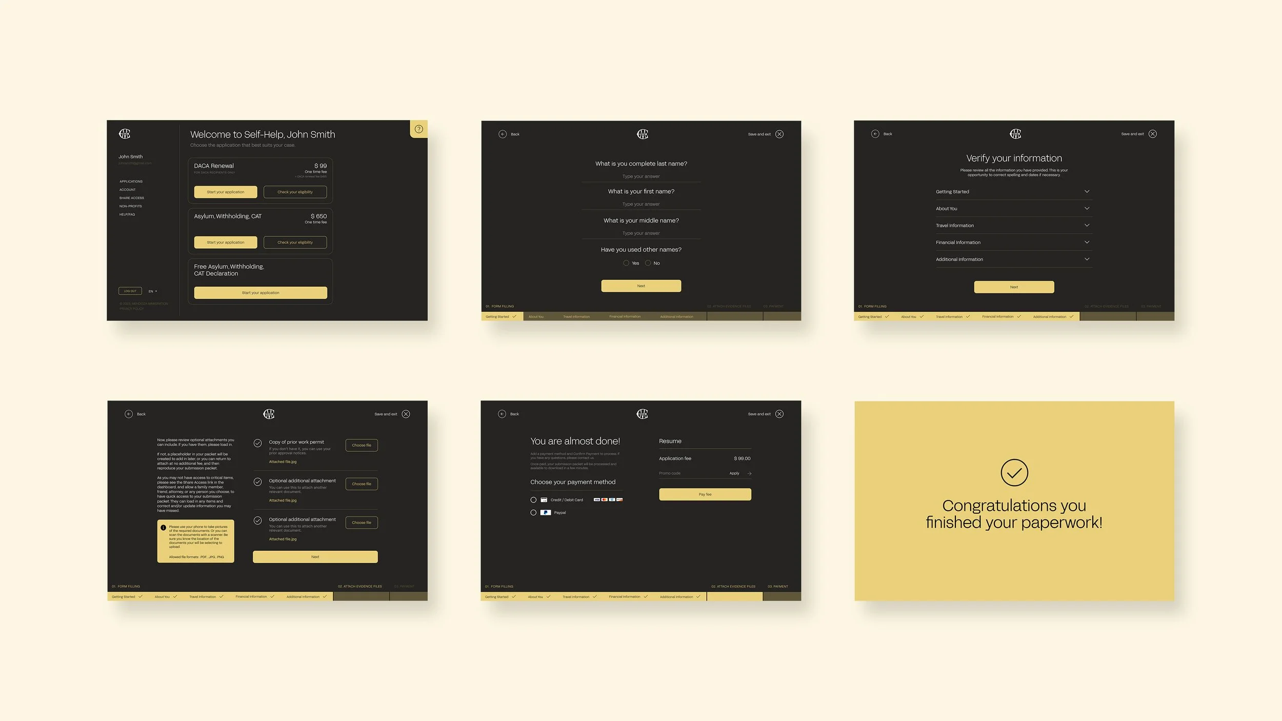
Enhancing User Experience with a Wizard Questionnaire Approach
I opted for a wizard questionnaire approach to address the issue of users getting overwhelmed during the form-filling process. With this approach, the form is divided into a series of questions, displaying one question at a time and eliminating irrelevant information. This helps reduce the time it takes to complete the form and creates a sense of progress for the user, making the process more engaging and interactive.
To make the process more engaging and rewarding, I incorporated micro-interactions such as a checkmark animation to indicate when the user has completed a form section.
Mobile adaptation
The layout and design were optimized for smaller screens, with a simplified navigation menu and larger buttons for ease of use. The content was also adjusted to fit the mobile screen and load quickly, without sacrificing the essential information.
